Typography and design principles can often feel intimidating for web developers. However, having a dependable and established foundation to reference while creating new projects and designs can be an invaluable resource. In this discussion, I'll present some swift "cheat codes" that can significantly enhance your design skills.
These "cheat codes" helped form the baseline for how body content is laid out on Dear Developer, and are consistently used in other content heavy websites and designs, so let's begin!
Apply a slight negative letter spacing on Heading elements.
Negative letter spacing, when used judiciously, creates a subtle but impactful effect. It can help headings stand out by subtly pulling the characters closer together, making the text more visually compact and emphasizing its importance. However, it's essential to exercise restraint to avoid affecting legibility negatively.
A good place to start for is between -1% and -2% on heading elements.
CSSh1,h2,h3 {
  letter-spacing: -0.01em;
}
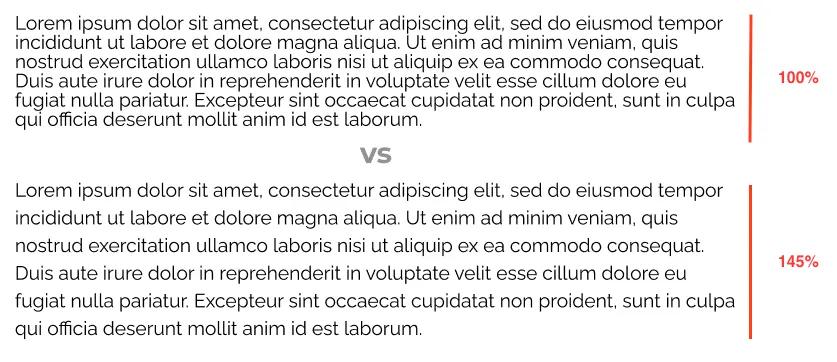
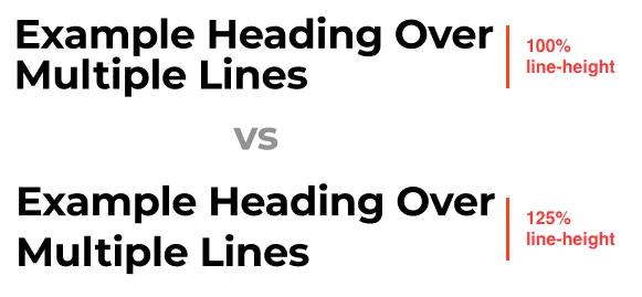
Apply a 1.45x line height for paragraphs, and a 1.25x line height for headings.
Utilizing a 1.45x line height for paragraphs and a 1.25x line height for headings helps create a balanced typographic hierarchy.
CSSh1,h2,h3 {
  line-height: 125%
}
p {
  line-height: 145%
}
A slightly larger line height for paragraphs ensures comfortable reading, preventing text from feeling cramped.

(Increasing line-height from the base 100% value drastically increases readability and reduces eye strain)
Conversely, a slightly smaller line height for headings maintains a clear distinction between headings and body text, improving overall readability and visual hierarchy.

(An increased lineheight to 125% over the baseline 100% reduces cramping and increases readability)
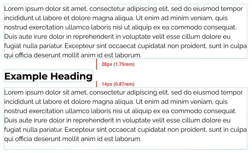
Space unrelated typography elements twice the amount as related elements:
This practice contributes to a cleaner and more organized layout. This practice ensures that there's a noticeable visual separation between different sections of content, making it easier for users to scan and comprehend the information. It enhances the overall visual clarity and structure of the page.

(Doubling the space between unrelated typogrpahy elements creates a clear seperation of concerns with minimal effort)
An easy way to apply this is to use margins on your heading elements:
CSSh2.subheading,h3.subheading {
  margin-bottom: 14px;
  margin-top: 28px;
}
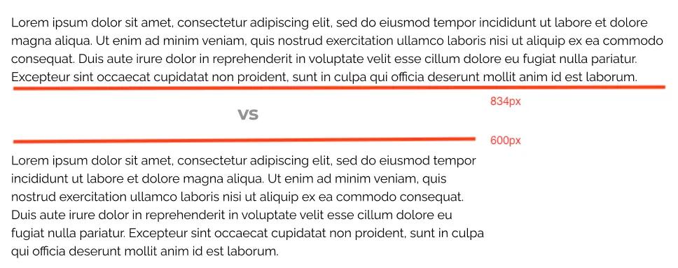
Stick towards a 50-75 characters width on body text (600 - 680px) body width on text heavy pages
This range prevents lines of text from becoming excessively long, which can make reading more challenging. By maintaining an ideal line length, you ensure that readers can follow the text comfortably from one line to the next, enhancing the overall reading experience on content-rich pages.

(Reducing the width of body text also drastically increases readability)
Simply set a max-width on your paragraph text container
CSS.paragraph-text-container {
  max-width: 600px;
}
Closing
By integrating these four essential tips, you can consistently and effectively enhance your projects and designs. Don't forget to check out our comprehensive article on maintaining uniform font sizes in web development here. This combination of insights will undoubtedly propel your typography skills to new heights!


